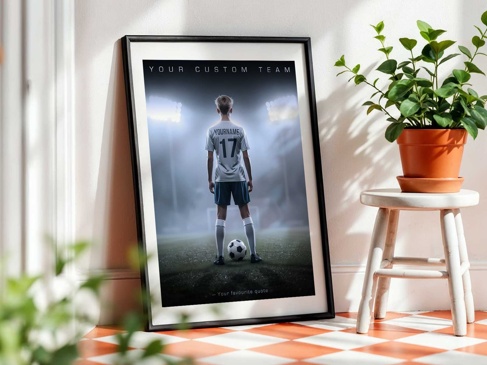
When a poster is designed around a player’s identity—name, number, colors, role and a defining image—it stops being generic wall art and becomes a personal story in one frame. For youth players especially, an identity-driven poster captures a moment: a breakthrough season, a first starting lineup, a captaincy, or simply the way they played that year. Hung over a bed, in a locker corner, or on a memory wall, that poster reads both as confident décor and as a quiet record of progress.
There are a few reasons this dual function feels natural. First, personalization anchors the object to a life rather than a trend. Seeing a player’s name and number in familiar team colors makes the piece specific: it belongs to a person and a place in time. Second, the visual language of soccer—clean lines, bold numbers, action silhouettes—translates well into graphic art. Those strong shapes make the poster work at a glance as room styling while still holding layered meaning for anyone who knows the backstory.
Think of the poster as a snapshot and a compass. As a snapshot, it freezes a season’s mood: gritty defense, a breakthrough goal, or the rhythm of a midfielder’s play. That memory is what parents, teammates, and the player themselves return to when they pass the poster months or years later. As a compass, the poster becomes a visible encouragement—a reminder of effort, identity, and the next step. For a teenager, that reminder on a bedroom wall can be quietly motivating without needing trophies or long captions.
[IMAGE_INSERT_ARTICLE_01]
Practical placement reinforces the poster’s double life. In a bedroom, a well-designed player poster complements bedding and shelves while asserting a personal narrative: this is who I am on and off the field. In a locker area or team corner, the same poster can sit alongside medals and schedules, becoming part of a season’s archive. On a family memory wall it reads as one piece within a broader story—season-by-season growth shown through changing numbers, photos, and roles.
What distinguishes a keepsake-style poster from a generic soccer print is the selection of details that matter. A plain soccer silhouette is decorative; a poster that includes the player’s position, a date or season label, a meaningful quote, or a candid action shot is remarkable because it references lived experience. Those small elements are what turn decoration into heirloom: they let viewers reconstruct the moment, not just admire the design.
Gifting a player-focused poster at season end, after a promotion, or for senior year works because the object signals attention. It’s not a mass-market item but a recognition of particular progress. Parents and coaches often choose such pieces to mark a transition—when youth league play becomes high school competition, or when a player completes a memorable season. The poster then becomes a physical marker of that stage, easy to display and simple to live with.
Finally, the visual clarity of soccer imagery helps these posters age well. Bold typography, a restrained palette tied to team colors, and an uncluttered layout keep the poster readable and relevant as the room’s style changes. Years later it can still evoke pride and growth without feeling dated.
In short, a poster built around a player’s identity works because it blends the practical strengths of good graphic design with the emotional weight of personal memory. It dresses a room and preserves a season at once—an object that looks intentional on the wall and meaningful in the heart.