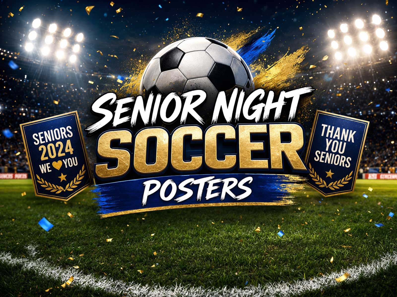
Senior Night is one of the few school sports rituals that asks a crowd to pause, remember, and thank individual players. A well-designed senior poster should act like that pause: clear, dignified, and focused on the player’s identity without visual clutter. Below are practical choices—about portrait, typography, number placement, team colors and ceremony display—that keep a tribute poster readable during the event and beautiful enough to keep as a long-term keepsake.
Focus on the moment: why clarity matters
During introductions or a slow walk across the field, people see the poster from a distance and often for only a few seconds. Prioritize a single visual message: who this player is. Avoid adding busy backgrounds, multiple photos, or long bios. A clear portrait, bold name, and number visible from 20–40 feet will communicate identity to family, teammates, and the crowd when it matters most.
Portrait and photo choices
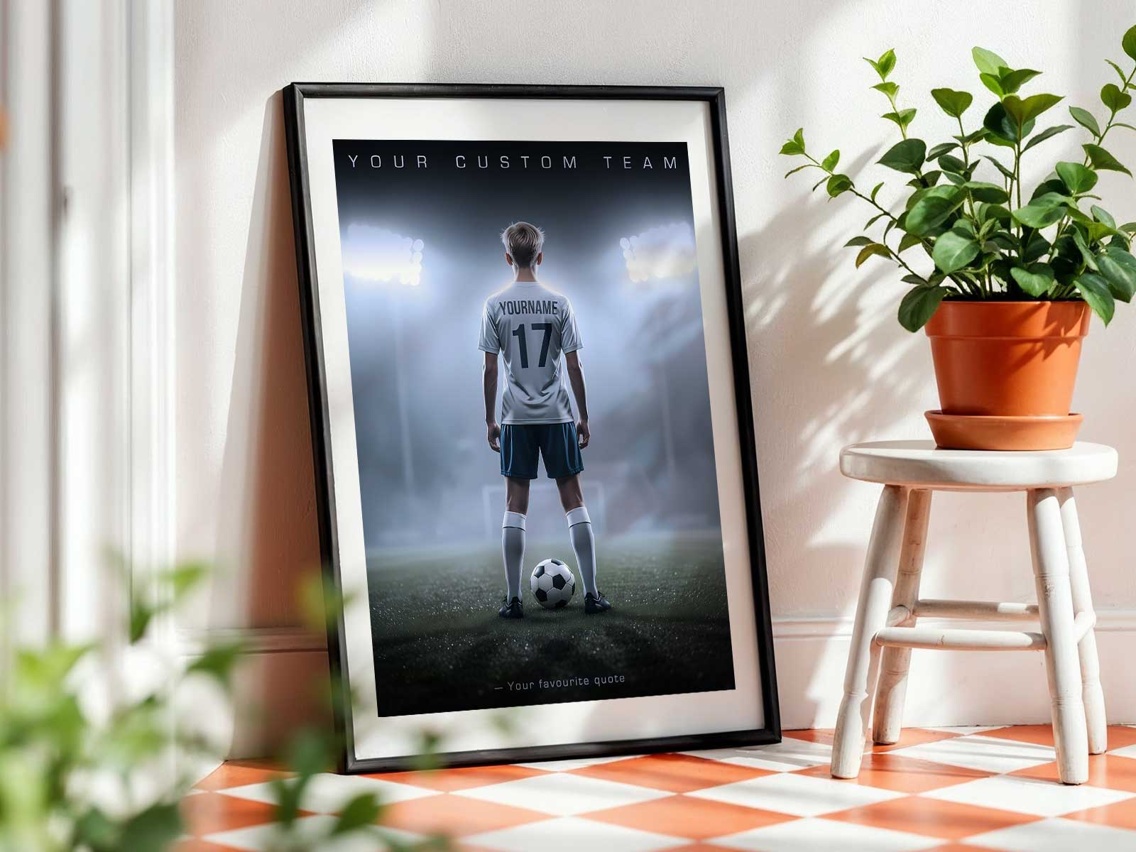
Use one strong portrait rather than a collage. A mid-torso or head-and-shoulders shot with the player looking slightly off-center feels intimate without being stiff. High contrast and natural lighting help the face read at a distance—avoid backlit or crowded action shots for the main image. If you want action imagery, use it as a muted secondary element or on the back of the poster so it doesn't compete with the portrait.
Name, number and team identity: hierarchy and placement
Decide hierarchy before you lay out the poster. Typical readable hierarchy: portrait first, then name, then number, then team/school. Keep these rules in mind:
- Make the last name the most prominent typographic element; it’s how families and announcers look up the player during introductions.
- Place the jersey number near the portrait—either overlaying a corner or set opposite the face—large enough to read from a distance but not overpowering the name.
- Put the school or team name and year in a smaller, secondary band so it supports identity without creating visual noise.
Visual style and color: pride without clutter
Use team colors sparingly: one dominant background color and one accent color keep the poster cohesive. Avoid full-bleed patterns or competing gradients. Clean geometric shapes—a banner for the name, a circular badge for the number—help separate information without decorative overload. Limit fonts to one or two complementary families: a strong sans for the name and a simple serif or condensed sans for supporting text.
[IMAGE_INSERT_ARTICLE_01]
Ceremony display ideas
How the poster is shown tells part of the story. Mounted on an easel at field level, it reads to the stands and looks respectful during a walk-by. For the presentation, consider having the poster handed to the player after their name is called so it becomes a photographed memento. If multiple posters are displayed along a fence, space them evenly and orient all portraits the same way to avoid a cluttered visual line.
Keepsake value and aftercare
A senior poster that reads well on game day usually becomes a treasured keepsake. To protect that memory, suggest backing the poster with a firm board and storing it flat or framed. Keep the front design minimal so the poster works as room decor later: a clean portrait, clear name, and a subtle team stripe age better than a seasonal layout loaded with logos and event copy.
Final thoughts: balance emotion with restraint
Designing a senior night poster is an exercise in restraint: the occasion calls for visible pride and heartfelt recognition, not visual noise. Choose one clear portrait, a strong typographic hierarchy (name over number over team), and a restrained use of team colors. That balance makes the moment of recognition powerful and ensures the poster will continue to feel meaningful long after the final whistle.