Team pride and private memory need not compete. A soccer team poster can simultaneously signal belonging to a club and hold a player’s personal story—if it balances shared identity with specific details that anchor one season, one role, one life. This piece explains how color, memory, and personalization work together so a poster reads as a keepsake rather than an anonymous print.
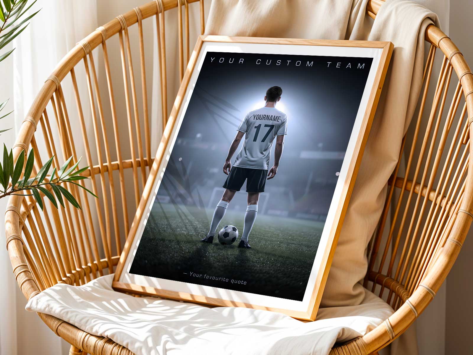
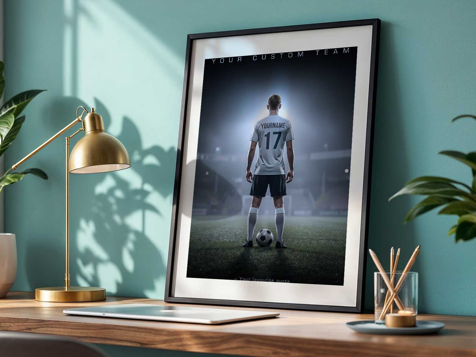
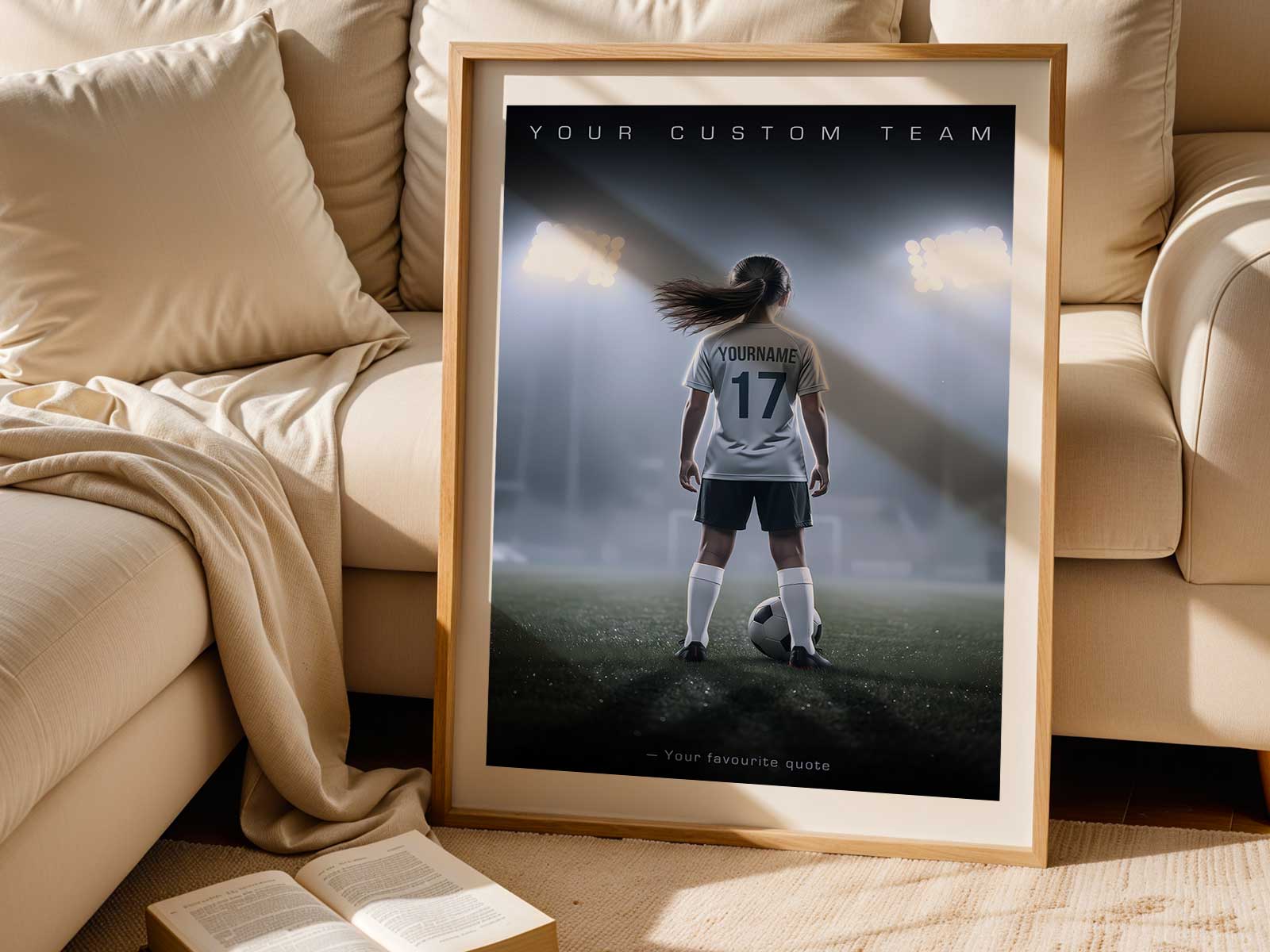
Begin with the obvious: colors and symbols quickly communicate team identity. A background wash in the club’s primary hue, a subtle crest, or a repeating stripe give a poster an immediate sense of belonging. But those elements should behave like a frame, not the whole story. To keep the poster intimate, pair these team cues with small, unmistakable personal markers—a name, number, or position line—that make the piece read as someone’s story instead of a generic team ad.
Memory is what shifts a design from decorative to devotional. Choose a season marker—"Fall 2025," "U14 League Champs," or "Tournament Week"—or a short caption that recalls a moment: "first goal," "starter at midseason," or "comeback at regional semi." Those cues prompt the viewer to remember heat, faces, and effort. They also let the poster age honestly: it’s not meant to be timeless; it’s meant to be true to a chapter of play.
Photographic identity, used thoughtfully, strengthens intimacy. A cropped action shot of a favored move, a candid sideline moment, or a close-up of cleats on dewy grass reads as personal without needing a full portrait. If a team image is dominant, balance it with overlays of individualized text or a faded vignette that highlights the subject without erasing the group context. The result keeps the team story visible while centering the player’s presence.
[IMAGE_INSERT_ARTICLE_01]
Composition matters. Clean layouts—strong typography for name and number, a restrained palette, and clear visual hierarchy—make the poster look like intentional wall art rather than a posterboard flyer. Strong soccer visuals—motion lines, ball arcs, and silhouette shapes—translate well to a range of spaces: bedrooms, locker areas, family rooms, and hallways where the poster can function as both decor and memory anchor.
Think about who receives the poster and why. Parents often want a visual record of a season’s growth; players want a reminder of effort and identity; coaches may appreciate a subtle team tribute. Tailoring the poster’s tone to the recipient changes the balance: a parent’s piece can lean into the family’s perspective with a season timeline, while a player’s keepsake might emphasize number, role, and a single decisive moment.
Finally, avoid impersonality by choosing details that only the owner would recognize or value. A nickname in the margin, a small icon for a position (wing, keeper, forward), or a note about a season milestone prevents the poster from feeling interchangeable. These small choices convert shared symbols into private meaning.
When colors confirm team ties, memories anchor a time, and personal details claim the story, a soccer team poster becomes more than decoration. It becomes a portable memory wall: a reminder of hard training, team belonging, and a particular season’s identity—visible proof that the player was part of something larger while remaining unmistakably theirs.