There’s a clear line between a themed print and a keepsake. A keepsake poster stops being background and starts being a reminder: of practices in driving rain, the first goal, the halfway-season push, or a coach’s pep talk. When you make your own football poster intentionally, small design choices — the player's name, the number on the back, a single photo, the season and the palette — combine to turn a piece of wall art into a meaningful object that holds a story.
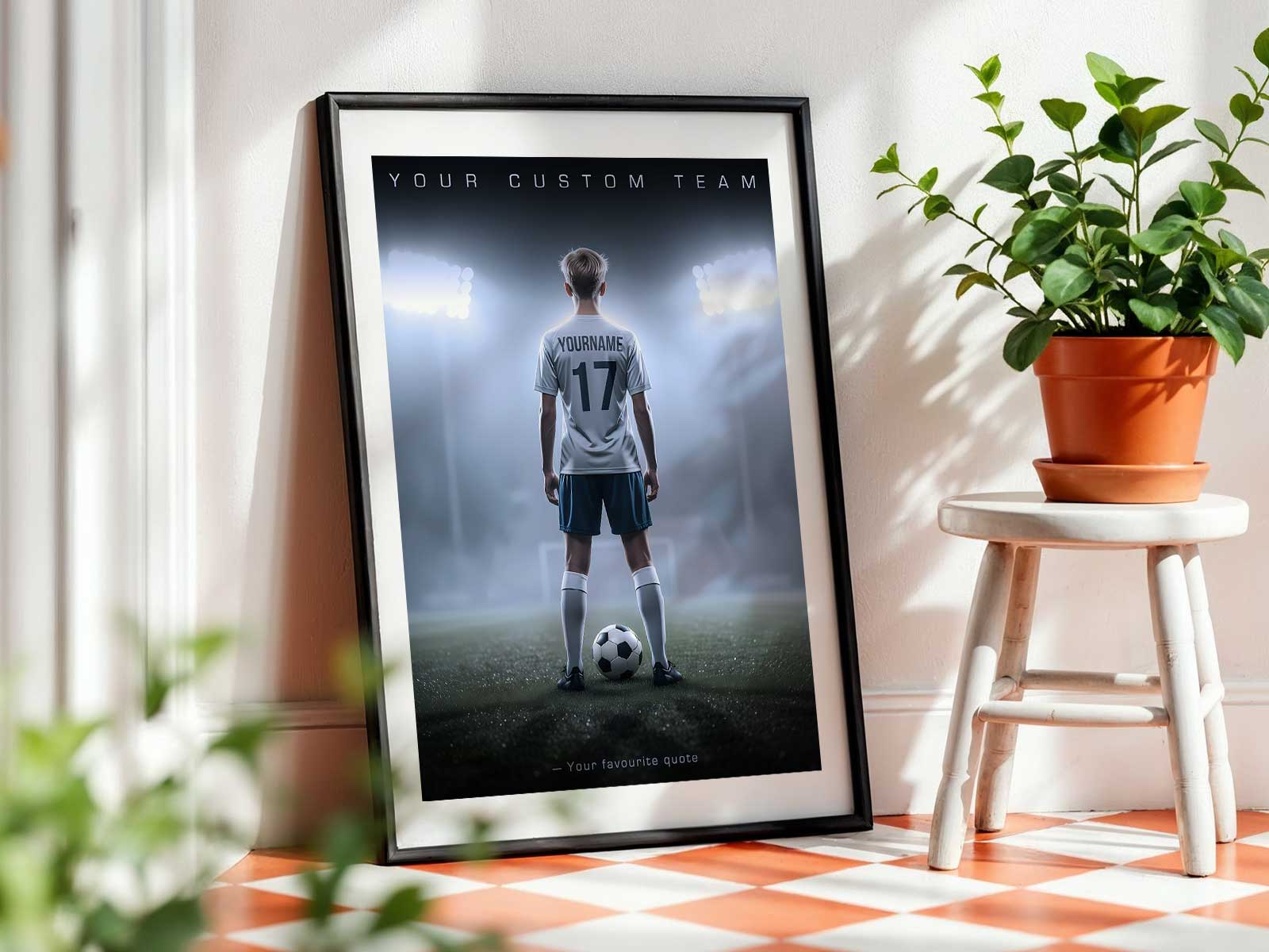
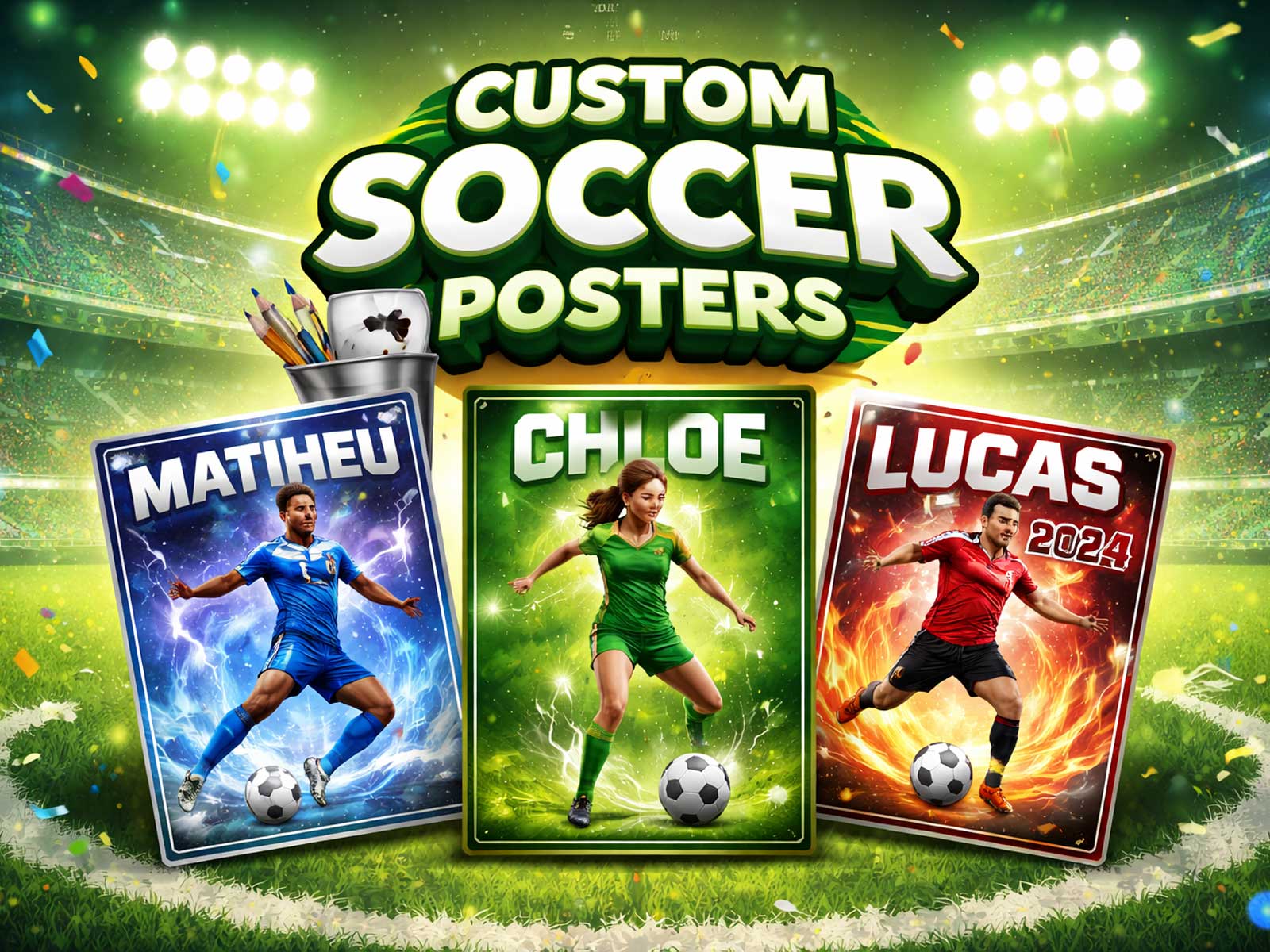
Begin with the name. Seeing a first name, nickname, or full name on a poster does more than identify; it personalizes the moment. A name anchors memory. It makes the poster read like a personal tribute rather than a generic tribute to the sport. For a young player, their name in bold type becomes an affirmation every time they enter their room. For a parent or coach gifting the poster, it signals care and attention to who the player is — not just what they play.
The number is equally powerful. Numbers carry position, role and moments: the striker’s nine, the captain’s armband number, the goalkeeper’s one. Including the season’s number on the shirt or a dedicated area on the layout ties the image to a specific chapter. When a poster reads “Season 2025” or “U12 2024-25” it becomes a time capsule. Years pass, players grow, and that number-season pairing reminds everyone what stage the player was in — a snapshot of effort and progress rather than an anonymous picture.
Choose one strong photo. A single, well-chosen image — an action shot, a sincere smile after a match, or a posed portrait in kit — allows the eye to rest and the memory to focus. Too many photos dilute specificity. A single photo, cropped with respect and printed with clarity, gives weight to the moment it captures. If the poster is a gift, pick a photo that tells a story the recipient will return to: a decisive play, a candid sideline laugh, or a team huddle that sparked confidence.
Season and context are subtle but persuasive details. Mention the year, the tournament, or a short line like “End of Season 2024 — County Cup” to anchor the achievement. That small textual detail converts a nice image into an archival piece: the poster becomes evidence of a stage in development, a reminder of growth and shared effort rather than just an attractive object.
Finally, colours and layout do more emotional work than you might realize. Using team colours or a restrained palette draws connection to identity and belonging. A poster in the team’s blue and white reads like a badge; neutral palettes with a single accent colour feel classic and keepsake-worthy. Clean, strong typographic choices and balanced negative space keep the piece elegant on a bedroom wall, in a locker area, or above a trophy shelf. A design that respects hierarchy — name, photo, number, season — makes the memory legible at a glance.
When these elements come together, the poster is no longer just themed decor. It becomes a tangible memory that encourages pride and reflection. It can be a confident wall anchor in a kid’s bedroom, a quiet reminder in a home office, or a celebratory piece in a team room. As gifts, these posters celebrate effort and belonging: they say, “We saw your hard work,” and “This was your season.”
Design with intention. Limit the clutter, highlight the personal details, and favour clarity and warmth. That’s how a custom soccer poster moves from pretty to precious — a visual keepsake that grows with the player, carrying the pride of a particular season long after the boots have been put away.