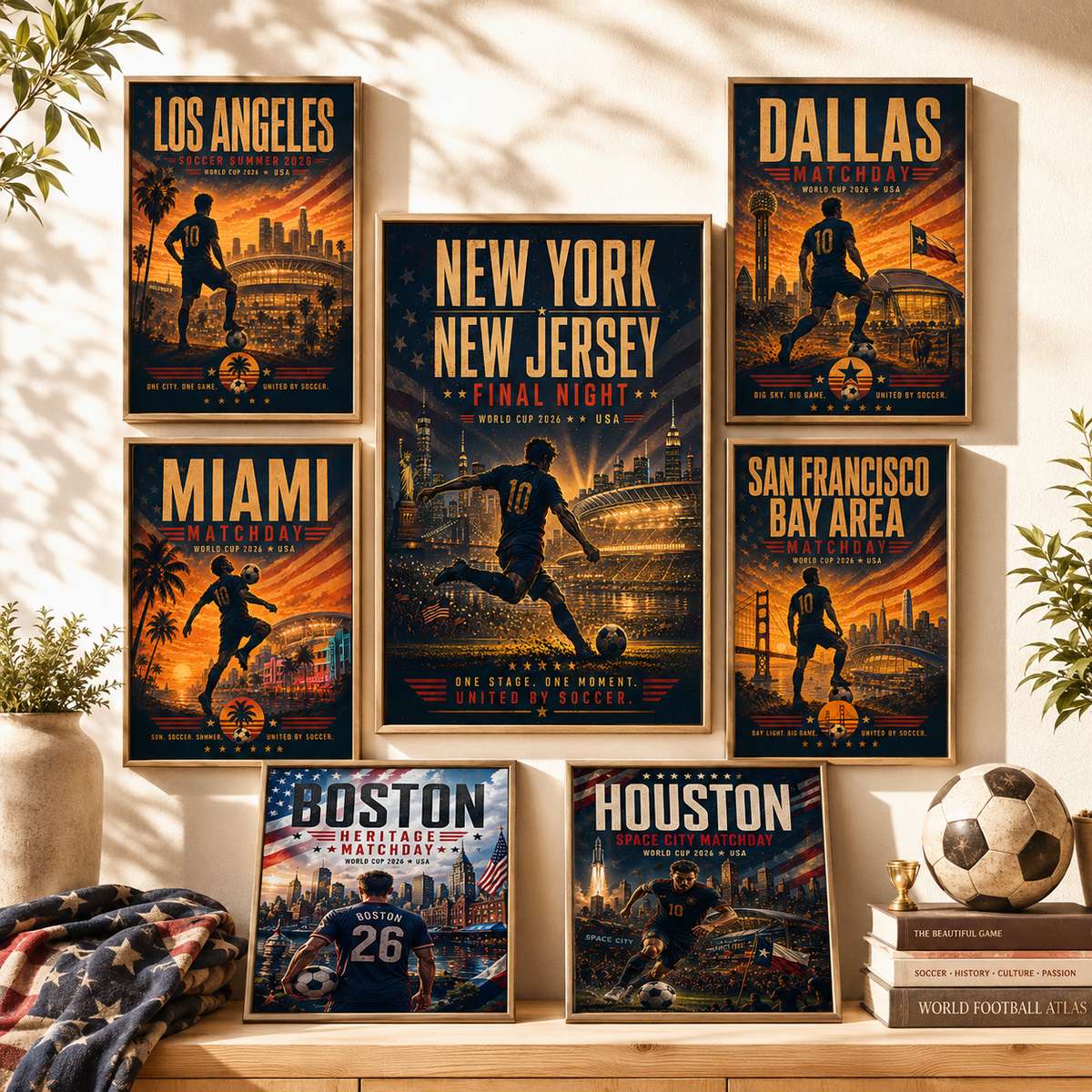
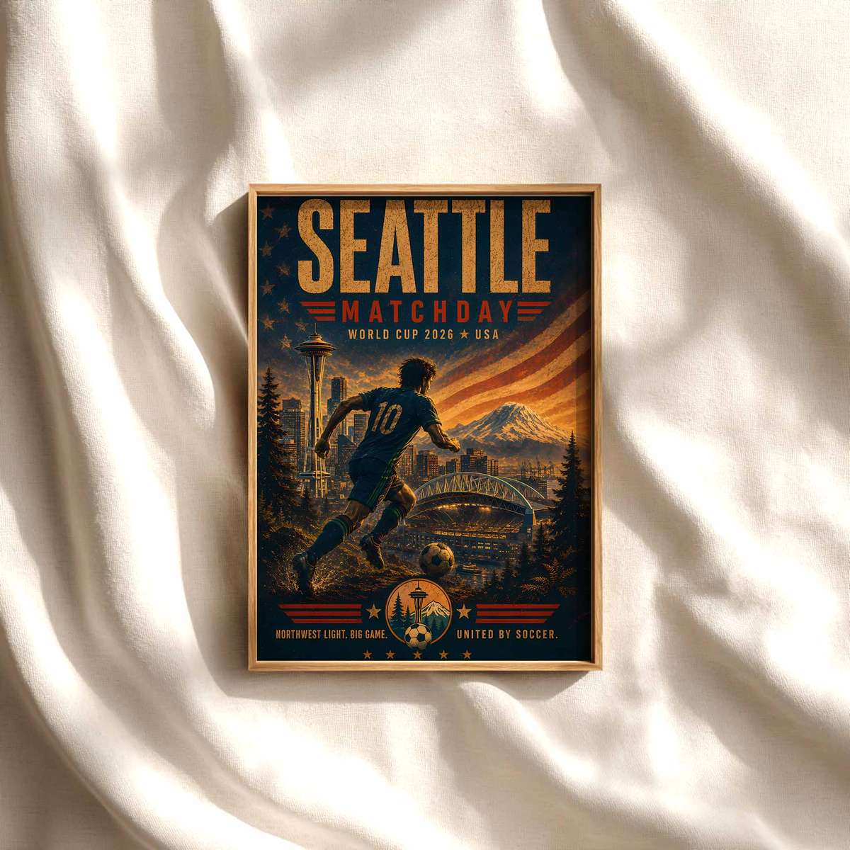
Turning a supporter’s passion into a football Premier League poster means more than copying a stadium shot. A keepsake-style poster is built to carry memory, identity and time: a restrained palette drawn from club or national colours, a clear typographic hierarchy that highlights name and number, and small personal details that anchor the image to a season or a moment. Those design choices make a poster read as intentional wall art rather than a fleeting event flyer.
Start with colour. Using a restrained palette based on team or national colours helps the poster instantly read as connected to the club or country the fan loves while keeping the design calm and durable in a room. Limiting the palette makes it easier for the poster to sit with bedroom décor, a game-room wall, or a locker-area display without competing with other elements.
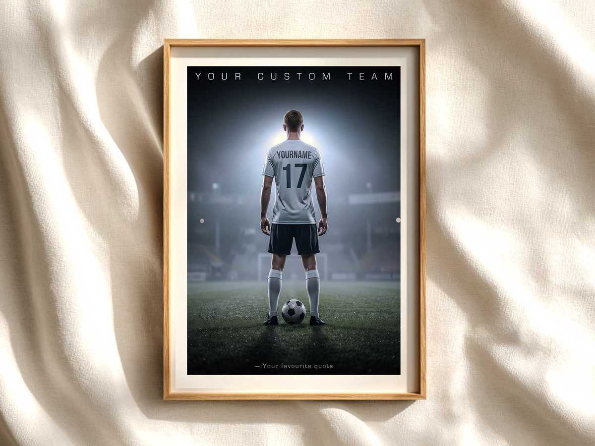
Typography matters as much as imagery. Strong, readable typography with a clear hierarchy — player name and number first, then a season or short slogan, then any small anecdote or date — gives the poster weight and purpose. That structure transforms personal details into a composed visual statement so the piece looks like considered wall art instead of a busy match flyer.
Personal details are what shift a poster from merch into memory. Including a fan’s name, preferred number, a meaningful season or hometown, or a short line of text about a milestone anchors the image in a story. Those elements make the poster a reminder of effort, growth or pride: a captured stage of a player’s journey or a family season together rather than a generic club image.
Signal club identity without relying on exact trademarks. Design approaches that translate club references into original graphic attributes — colour fields, simplified motifs, or typographic treatments inspired by a crest — let a poster feel loyal without reproducing protected artwork. This subtle translation preserves recognition while keeping the visual clean and legally safe.
Think about finish and material from the start. Choices such as matte versus glossy and paper weight influence how the poster endures on the wall and how light affects legibility. A low-glare finish helps the poster remain a visible part of the room without distracting reflections, which matters for long-term displays in bedrooms or shared spaces.
[IMAGE_INSERT_ARTICLE_01]
Design tools and modern services make polished results accessible to non-designers. Templates, AI-assisted mockups, and custom-print vendors help fans combine a personal photo or preferred number with club-inspired colours and clear type so the final piece looks intentional — even when the creator is not a trained designer.
Finally, consider where the poster will live. A keepsake poster works differently as bedroom décor, a sports-room focal point, or an end-of-season gift on a memory wall. Naming the space while you design — and choosing the palette, hierarchy, and finish accordingly — helps ensure the poster ages well as a visual reminder of a season, a role on the team, or a shared pride between player and family.
In short: a focused palette, strong type, personal details, club-inspired graphic translation and sensible print choices let a football Premier League poster become more than decoration. It becomes a durable keepsake that tells a personal story in one clear, lasting image.