There’s a difference between a poster that screams “kid’s room” and one that quietly holds a season of memories. A cool soccer poster becomes timeless when it’s designed like a keepsake: clear visual hierarchy, confident color choices, and details that point to the player’s identity rather than a plate of stickers. The result is wall art that reads as intentional décor and also works as a personal reminder of effort, growth, and team belonging.
Start with balance. A strong composition gives the eye a place to rest: a central portrait or action shot balanced by a clean block of color, or a horizontal layout with a focused photo on one side and typographic information on the other. This kind of structure keeps the poster from feeling busy and makes each element important—name, number, position, or a season year—rather than decorative noise.
Colors and contrast: bold, not garish
Colors are how a poster communicates mood instantly. Use the team palette but simplify it: one dominant color, one accent, and a neutral background. Strong contrast between photo and background keeps the player readable from across a room. Avoid gradients and neon effects that compete with the photo; instead, pick saturated tones that echo the kit and boost presence. That restraint is what separates a souvenir poster from teenage clutter.
[IMAGE_INSERT_ARTICLE_01]
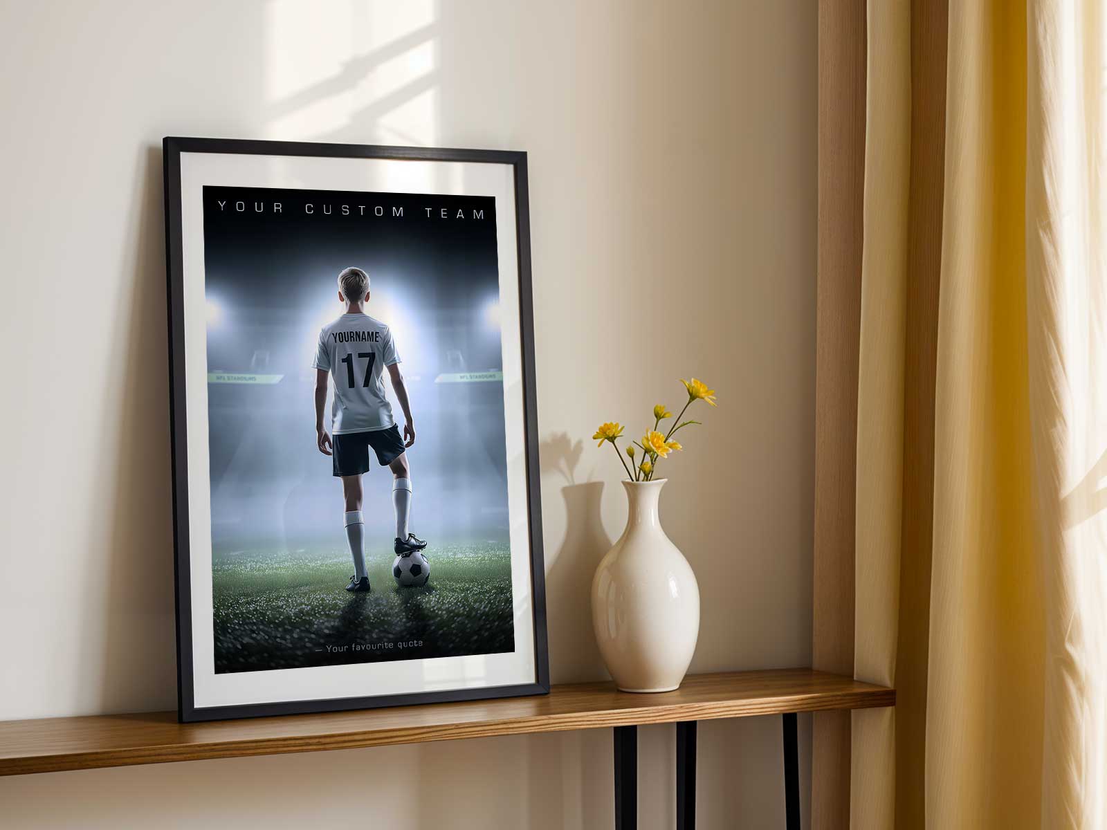
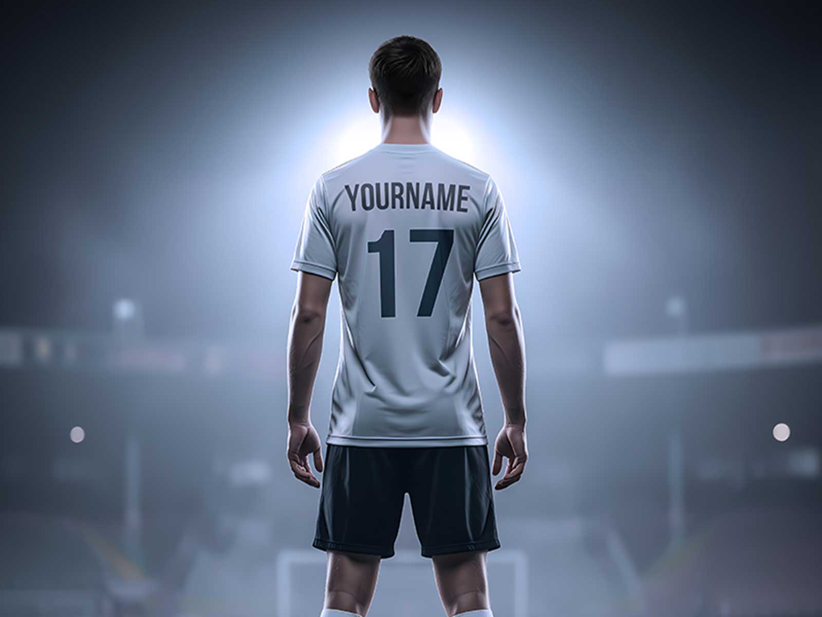
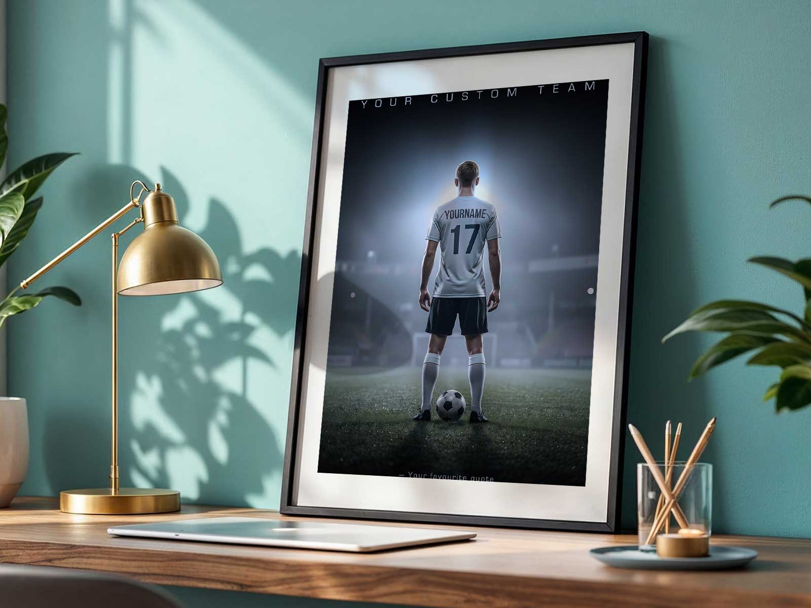
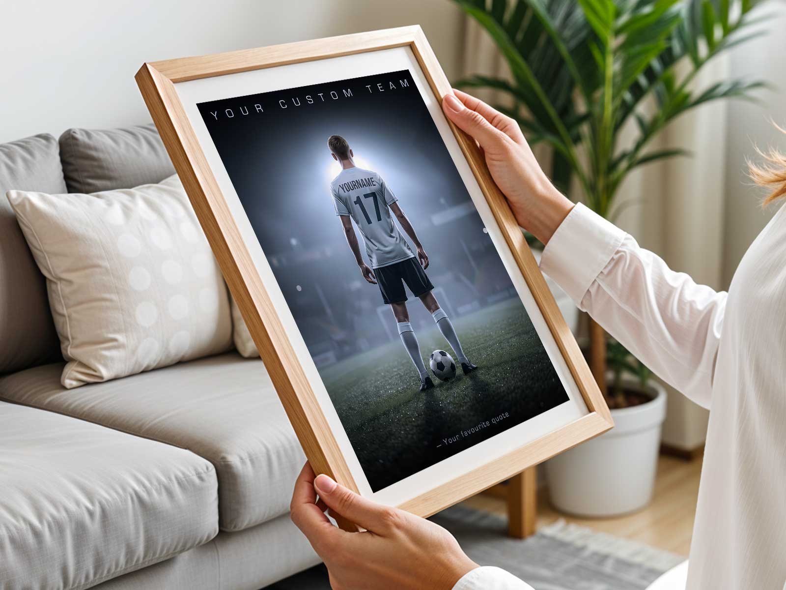
Personalization is the emotional heartbeat. Adding a name, number, season, or a short nickname turns a print into a story starter. A photo-based poster that includes an authentic action shot or candid training moment indexes a memory rather than a celebrity. Those small identifiers—stitched into the composition as simple typography or a subtle badge—give the piece meaning without shouting.
Think about context. Posters that work in bedrooms, game rooms, or communal spaces are legible at a distance, show clear focal points, and pair well with shelves or framed trophies. A poster designed with scale and sightlines in mind lets it hang above a desk or beside a locker and still feel integrated with the room. When it’s sized and composed to be seen, it naturally becomes part of the player’s daily environment—something that reinforces pride every time they pass it.
Emotionally, a keepsake-style poster holds more than a moment: it holds identity. A minimalist layout that highlights a player’s expression, role on the team, or a decisive match moment becomes proof of progress. Parents and coaches prize that kind of object because it’s both personal and presentable: suitable for display at home, in a clubhouse, or as an end-of-season gift that feels considered rather than gimmicky.
Design choices that age well are important. Select typography with character but not trends, favor durable, matte printing over glossy finishes that catch fingerprints, and avoid ephemeral slang or stickers. A poster that remembers a season without tethering itself to a fad will still look relevant as the player's game—and taste—mature.
Finally, consider what the poster should say beyond aesthetics: encouragement, identity, and belonging. A compact line of copy—season year, team name, or a short motto—can transform the object into a small ceremony of achievement. In that way, a cool soccer poster is never just wall art; it’s a visible claim of effort and a daily nudge toward the next match.
Whether it’s a first season, a final year in a club, or a breakthrough moment, the right balance of composition, color, and personalization turns a soccer poster into a meaningful keepsake rather than adolescent clutter.